The homepage is the digital face of your business. You have less than five seconds to grab a visitor’s attention and convince them to stay. A poor homepage structure is a guarantee of lost customers and revenue.
In this article, we reveal the “behind the scenes” of our work and show what should be on the homepage of an online store so that it works for you 24/7.
We will break down our step-by-step process for creating an effective homepage design — from defining goals to final visual accents. This is not magic, but well-thought-out sales engineering.
Step 1: Define goals and USP
Before drawing the first rectangle in Figma, we answer the key question: what is the most important thing a visitor should understand in the first 5 seconds? The answer forms the basis of the first screen — the most important part of your homepage. 
- Formulating the USP (Unique Selling Proposition)
Your USP is a short and clear answer to the client’s question “Why should I buy from you?” We help formulate it to be as persuasive as possible.
- Poor USP: High-quality products at affordable prices.
- Good USP: Artisan cheeses with same-day delivery.
- Defining the key action (CTA)
What main action should the visitor take? The call to action (CTA) must be clear and noticeable.
- For e-commerce, this could be: Go to catalog, Learn about promotion.
- For service companies (like ours): “Get a consultation,” “Calculate cost.”
Step 2: Block structure
Once the goal is defined, we build the logical homepage structure. It works like an experienced sales consultant: welcomes the client, shows advantages, demonstrates products, handles objections, and guides to purchase. 
Here is the standard, time-tested structure we use:
- First screen: Captures attention with a strong USP and a clear call to action (CTA).
- Benefits block: Briefly answers “Why choose you?” Could include info on free delivery, guarantees, or unique service.
- Categories/products/services block: Quickly orients the visitor to your offerings.
- Popular products / bestsellers block: Shows top offers and encourages impulse purchases.
- Case studies and testimonials block: These are social proofs. They demonstrate your experience and build trust.
- Final CTA block: The last chance to convert a visitor into a customer.
Each benefits block and other elements should logically flow from the previous one, creating a seamless and persuasive story.
Step 3: Prototyping
Once the structure is approved, we move to prototyping. A prototype is a black-and-white “skeleton” of your future page. At this stage, we do not think about colors or images, focusing solely on logic, structure, and usability. 
Why do we need a prototype?
- Visualize structure — you see how all blocks and elements will be arranged and can assess the overall composition.
- Test UX — we walk through the user journey with you to ensure it is intuitive and all key buttons are in place.
- Save time and money — making changes to a black-and-white prototype is 10 times faster and cheaper than redrawing a finished design.
It is at the prototyping stage that we solve 90% of issues related to what should be on the homepage and how to place it for maximum effectiveness.
Step 4: Copywriting
In parallel with prototyping, we work on texts. Strong texts and headlines are the voice of your brand. They must be not only correct but also persuasive. 
Our approach to texts is based on the “language of results”:
- Talk about benefits, not features. Instead of “our knives are made from high-quality steel,” we write “our knives stay sharp for years.”
- Write for people, not search engines. Keywords are integrated organically so that the text remains easy to read and understand.
- Clear calls to action (CTA). Each text guides the user to the next logical step.
High-quality texts for homepage design are what turns a good-looking page into a tool that actually sells.
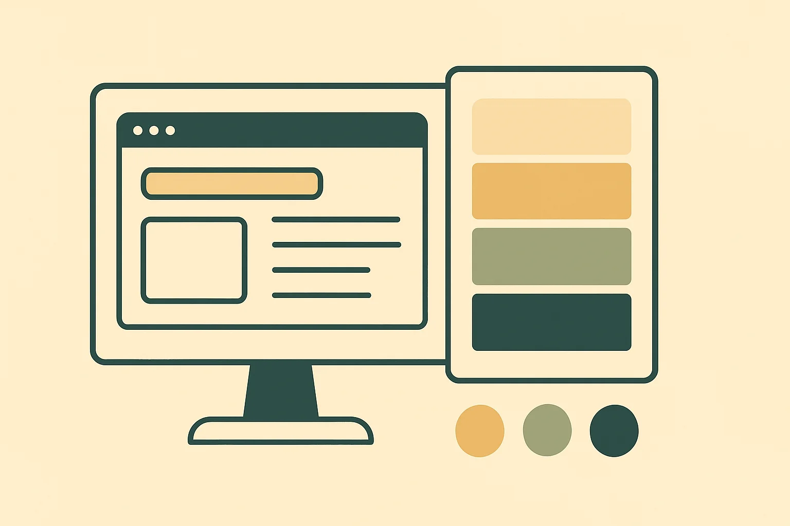
Step 5: Design and visual accents
Once the prototype and texts are ready, we move to the most exciting part — visual design (UI). Our goal is not just to make it look good, but to guide user attention and evoke the right emotions. 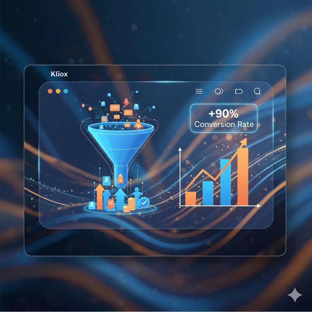
Our focus areas:
- Visual hierarchy — the most important elements (headlines, CTA buttons) are made largest and brightest so the user’s gaze moves exactly where we need.
- Brand style — we use your colors, fonts, and logo to create a cohesive and recognizable brand image.
- Whitespace and spacing — we do not overload the page. Plenty of white space makes the design clean, premium, and easy to perceive.
- High-quality visual materials — we select professional photos and icons that reinforce the text and build trust.
It is at this stage that the homepage design is created, which will be both functional and emotionally appealing.
Why this approach works
Creating a selling homepage is not an act of creativity but thoughtful engineering. Every step of our process, from analysis to design, is aimed at solving specific business goals.
This systematic approach works because it:
Is data-driven, not guesswork. We study your audience and competitors instead of relying on subjective “I like it” opinions.
Minimizes risks. Approving the prototype before design prevents costly revisions and ensures the final result meets your expectations.
Focuses on conversion. Every element on the page has a purpose — guiding the user through the funnel to the desired action.
That is why we at Kliox pay so much attention to homepage structure and its design.
Conclusion: your homepage can sell more
An effective homepage design is the result of systematic work, not chance. Thoughtful structure, a strong USP, quality copywriting, and correct visual accents are the key components that turn it into a powerful tool for attracting and converting customers. 
Remember, what should be on the homepage is not a matter of taste, but strategy. The right approach to its design directly affects your business profitability.
Want your homepage to work at 100%?
If you feel it is not delivering the desired results, or you are planning to launch a new project, we are ready to help.
Order a free audit of your homepage. We will analyze its structure, texts, and design, and provide 3 specific recommendations for improvement.