
developed interfaces
positive feedback about convenience
average sales growth
we create focus effectively
and we will offer a visual strategy to solve them.
Customers don't find the product they need and simply leave the site.
The site looks unreliable and does not make you want to place an order.
Mobile shopping is turning into torture, and customers are going to competitors.
We create a logical and intuitive customer path to the order.
We focus on the product and calls to action.
We build trust and emphasize the quality of your brand.
We guarantee the convenience of shopping from smartphones, tablets and desktops.
We analyze your niche, competitors, and target audience to create a design that will solve your business problems.
We design the user journey to make it as simple, convenient, and conversion-friendly as possible.
It also inspires trust and highlights the benefits of your product.
We guarantee that the shopping experience from your smartphone will be as seamless as from your computer.
We have formed a catalog structure with thoughtful filters, separate collections, and quick transition to purchase.
The Zentaro philosophy was conveyed through deep dark shades, contrasting typography, and an emphasis on fabric details.
We implemented management of products, sizes, balances, and orders with a flexible admin panel.
We created a logical catalog structure with multi-level filters by equipment type, power, brand, and purpose.
Visually, technical reliability and a professional approach were emphasized through a restrained color scheme and clear typography.
We implemented flexible management of products, characteristics, filters, and integration with CRM to automate applications.
We built a structure that logically leads from benefits to registration. We emphasized privacy, water safety, and the coach's individual approach.
Clients gained access to class history, subscription management, and online payments.
We automated the schedule, pool loading control, and communication with parents.
We start by discussing your goals and market analysis. Then, together with you, we create a moodboard — a visual reference board — to coordinate the future style of your project.
Based on the analysis, we create a black and white "skeleton" of the site (framework), where we think through the logic, structure, and location of all elements for maximum convenience.
We turn the approved prototype into a full-fledged design. We draw the main and key internal pages, select fonts, colors, and icons.
We design how your new design will look on tablets and mobile phones to ensure a seamless experience for all users.
We prepare and transfer to developers all the necessary files, fonts, icons, and UI kit to ensure that the final site will 100% comply with the approved design.
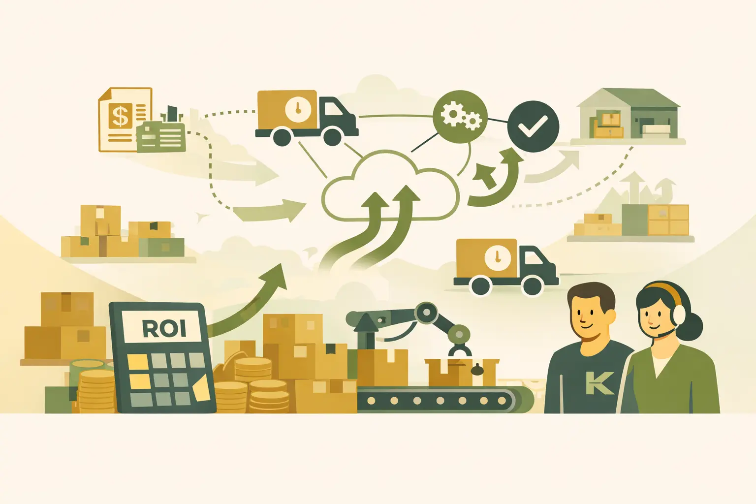
Imagine that your online store is already growing. Orders are coming in steadily and in large volumes, and you can no longer manage inventory storage, pack each parcel, and run to the post office yourself. Managers spend hours on logistics instead of sales. If you constantly think, “Where can I get more warehouse space?”, it’s […]
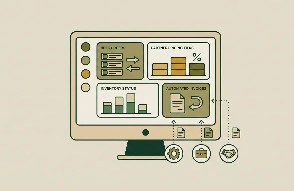
B2B e-commerce is the stage of a company’s maturity when direct business-to-business sales exceed retail in volume. If you still manage wholesale clients through email, Excel spreadsheets, and phone calls, you are not controlling your business potential. Instead, you depend on the human factor. Creating a B2B portal is not an expense for a new […]
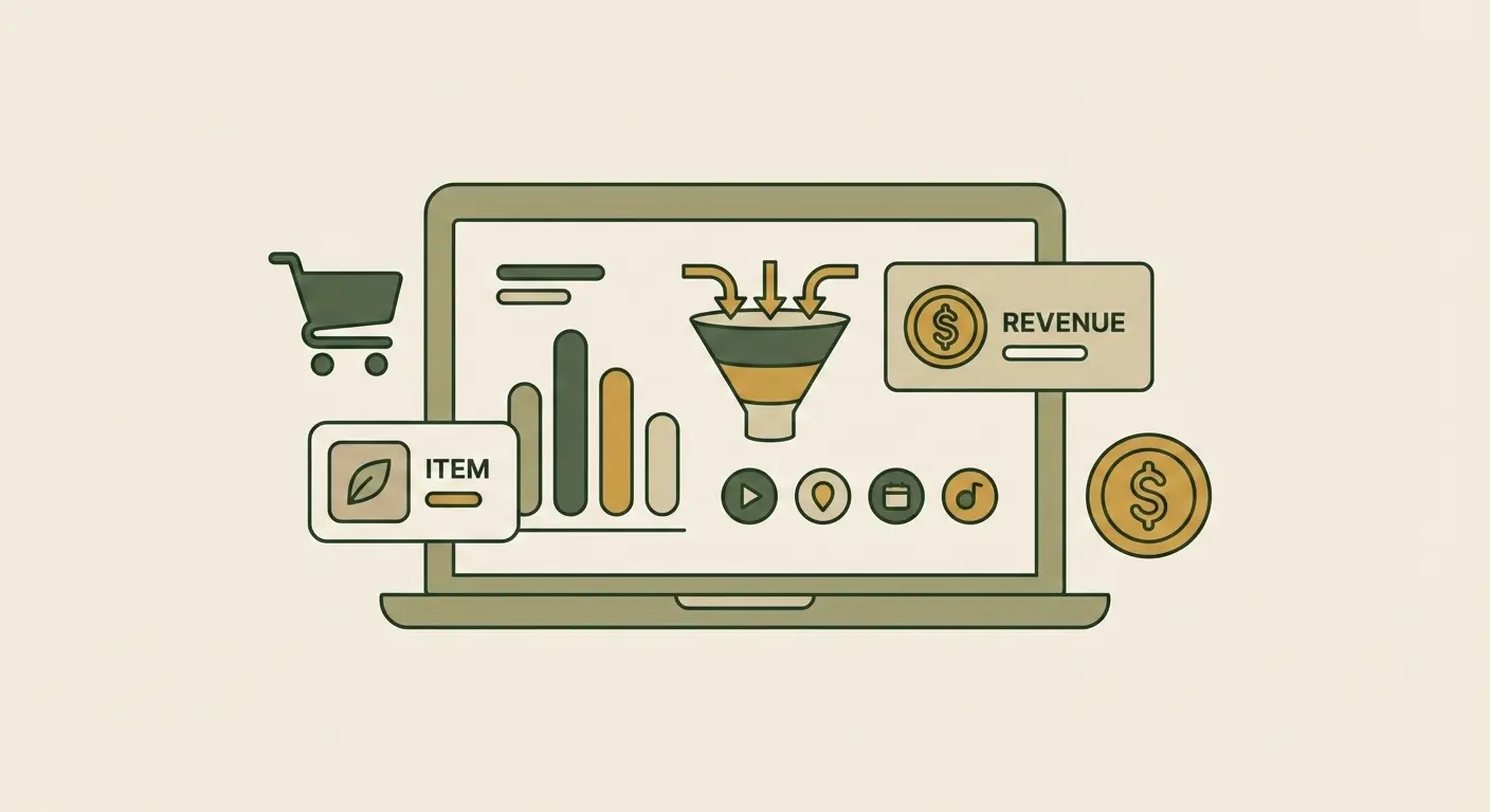
If you don’t measure, you don’t manage. An online store owner who makes decisions based on intuition is like a driver with their eyes blindfolded. Today, Google Analytics 4 (GA4) is not just a trendy tool — it is a critically important instrument for the survival and growth of your business. We will show how […]
Yes, of course. We can develop a complete design project for you, including all the necessary files and a UI kit, which you can hand over to any development team.
That's what the prototyping and moodboarding stage is for. We agree on the structure and visual style before we even start drawing. In addition, there is a certain amount of iteration and revision built into the process.
The timeframe depends on the complexity of the project. Design development for an average online store usually takes 10 to 20 business days, including all stages from analysis to final approval.
Logo and corporate identity development is a separate service. The website design is based on an existing logo. If you don't have one, we can develop one for you under a separate agreement.
We always create a design from scratch. This ensures that it will be unique, fully consistent with your brand, and ideally solve your business problems, rather than being a compromise template solution.
Let's discuss how the right design builds trust in your brand and increases conversions
Phone
+38 (066) 544 20 11We work online
Sunday - day off

UX/UI Design for an Online Store
A customer decides whether to stay on a website or leave within a few seconds. They do not read — they scan: is it clear where the catalog is, how to find what they need, and where to click to place an order.
If the interface makes people think, they go to a competitor. UX/UI design for an online store is responsible for creating that sense of ease when making a purchase is simple and the website looks trustworthy.
What Is UX/UI Design for an Online Store
UX and UI are often perceived as one concept, although they are different layers of work. UX is responsible for the logic of the customer journey, while UI handles its visual presentation. Therefore, ordering UX/UI design means working on both layers, not just the visual aspect.
Confusing logic drives customers away, while an unclear visual design undermines trust. Together, they determine whether a person will complete a paid order. UX Design and UI Design form a cohesive product, while a UX audit helps evaluate an existing website.
UX — User Experience
UX is about usability. The designer thinks through how a person moves around the website: how many steps it takes to reach the cart, whether it is easy to find a product using search and filters, and whether it is clear what to do on the checkout page.
Good UX is invisible. The customer simply follows the path to the order without experiencing friction. Poor UX is noticed immediately: when it is unclear where to click or when the required button has to be searched for.
UI — User Interface
UI is what the customer sees: colors, fonts, buttons, icons, spacing, and product photos. It shapes the first impression of the store and contributes to brand recognition.
What matters here is not beauty for its own sake, but how well the visual design serves its purpose. Visual accents guide attention to what matters most, the “Buy” button is immediately noticeable, and the product card can be read without effort. Visual design also maintains a consistent style across all pages so that the store does not look like it was assembled from different templates.
A well-designed user interface and a consistent visual style make the store recognizable from the very first screen.
Responsive Design
Most customers access online stores from smartphones, so the design is created for different screen sizes from the start. Responsive design is not a scaled-down copy of the desktop version, but a separately designed mobile experience. For example, it includes large touch areas, convenient filters, and a short path to the cart.
What looks good on a monitor often breaks on a phone: small buttons, long forms, or images that do not fit. That is why the mobile version is tested on an equal footing with the desktop version, and sometimes even earlier. The same approach works for landing pages, where all attention is focused on a single action.
Website Redesign
A redesign is needed when a store works, but its design is outdated or interferes with sales. Common signs include a high bounce rate, customers not reaching the cart, an inconvenient mobile version, and a website that looks outdated compared with competitors.
The task here is more complex than designing from scratch: you need to update the appearance and logic without losing what already works or disrupting the established behavior of returning customers. That is why a redesign starts with an analysis of current data rather than with a blank page.
Why Quality Design Is Important for an Online Store
Store design is not about “looking good” — it is about money. The same product at the same price can sell differently depending on how conveniently and convincingly it is presented.
One website guides the customer toward the “Buy” button, while another makes them think and hesitate. Design affects business results in several ways at once.
Improving the User Experience
A convenient website reduces the effort required from the customer at every step. Fast search, clear filters, a clean product card, and a short checkout process remove small obstacles that cause people to abandon their orders.
The fewer steps and doubts between “I want it” and “I bought it,” the more orders make it to completion. UX logic works here to improve retention because customers do not leave due to inconvenience.
Increasing Conversion
Conversion is the share of visitors who become customers. Design directly affects it. A noticeable order button, a clear path to the cart, a minimum number of form fields, and payment without unnecessary steps — each of these details increases the percentage of visitors who complete a purchase.
Often, it is small interface details rather than prices or product range that determine whether a person buys or closes the tab. When design removes these barriers, promotion and marketing work more effectively. Traffic is not wasted on a website that cannot turn visitors into customers.
Building Audience Trust
A customer will not leave their money where the website looks unreliable. Trust is built through details: a neat brand identity, high-quality product photos, a logo, clear delivery and return terms, visible contact information, and reviews.
When a store looks polished and consistent, customers have no reason to doubt that their order will arrive. This is especially important for new brands that customers see for the first time and evaluate within seconds, relying primarily on the visual presentation.
Increasing Average Order Value
Design helps sell more within a single order. “Frequently bought together” blocks, complementary products on the product page, bundles, and promotional sets suggest logical additions to the purchase.
When recommendations are relevant and do not feel intrusive, customers add another item to their cart without pressure from a manager. The key is to display them in the right context. For example, on the product page and during checkout, rather than as a random list.
Development Stages
The most expensive design mistakes are made not in the layout, but before it. When the structure and logic are not thought through in advance, beautiful screens later have to be redesigned around real customer scenarios. Therefore, online store development at the design stage is carried out systematically, step by step.
Analysis of the Business, Competitors, and Target Audience
Design starts with understanding who and what we are designing for. We analyze the product range, sales model, and customer behavior. What matters to them, what they are afraid of, and what criteria they use to choose a product.
We study competitors to understand solutions familiar to the target audience and avoid forcing people to learn how to use a website from scratch. At this stage, we create not pictures, but requirements for the future interface.
Creating the Concept and Moodboard
Before creating layouts, we define the overall direction: mood, style, color palette, and brand character. A moodboard brings references and visual guidelines together into a single picture that we approve with the client.
This is a cheaper way to agree on the visual direction than reworking finished layouts. This is where the brand identity of the future store takes shape: how it should feel and how it will differ from competitors.
Designing the User Flow Structure
User Flow is a diagram of the paths a customer takes to reach a goal. Even before the design stage, we map out how a person moves from the homepage to the catalog, from the catalog to a product page, from the product page to the cart, and then to payment.
This makes it clear where the path is too long, where a step is missing, and where a customer might get lost. Fixing the logic in a diagram takes a few minutes; fixing it in a finished layout can take several days.
UI Interface Development
Once the logic is approved, the designer gives it a visual form. Colors, fonts, buttons, grids, icons, and element states appear: how a button looks on hover, an active field, or an error message.
Each screen is built according to consistent rules so that the catalog, product page, and cart look like parts of the same store. At this stage, UI transforms from an abstract concept into concrete page layouts.
Interactive UX Prototyping
A static layout does not show how an interface behaves in motion. Therefore, we assemble key screens into a clickable prototype where buttons actually lead to other pages. We use it to test the customer journey in real time: is it clear where to click, are the transitions logical, and does the person get lost between steps? This allows UX problems to be found before development, when changes still cost nothing.
Mobile Version Design
The mobile version is not scaled from the desktop version; it is designed separately. A small screen involves different behavior: scrolling with the thumb, tapping without full visual attention, and shopping on the go. Therefore, filters are hidden in a convenient panel, buttons are made large, and the path to the cart is reduced to the minimum number of actions.
We also make sure that heavy product images do not slow down loading over mobile internet. For an online store, this is not a secondary screen but the primary one: most customers come from mobile devices.
Handover of Layouts to Development
A finished design is not simply a collection of images for a developer. We provide layouts with all states, grids, spacing, fonts, and element behavior so that the developer does not have to invent solutions on the fly.
We specify how the interface behaves at different screen widths, what happens in error and empty states. The more precise the handover, the closer the finished website is to the approved design, without surprises during implementation.
This approach connects design and web development into a single process, without a gap between the layout and the code.
What Determines the Cost of Website Design
Design is priced not “per website,” but according to the amount of work involved. The main factor is the number of unique layouts. A store with ten types of pages requires more time than a landing page with two screens. Homepage, catalog, product page, cart, checkout, personal account: each screen is designed separately, and each adds to the cost.
The depth of design work also matters. A ready-made template costs less but makes the store look like dozens of others. Custom design with its own brand identity costs more, but contributes to brand recognition. Mobile adaptation, interactive prototypes, and the number of states for each element are also taken into account.
Redesign and design from scratch are also priced differently. Updating an existing website can sometimes be more difficult because you need to preserve what works and avoid disrupting the logic customers are accustomed to. The exact cost is determined after analyzing the task, while approximate ranges can be found in the pricing plans.
Why Order UX/UI Website Design from Professionals
Ordering UX/UI design can be approached in different ways: entrust it to a freelance designer, build it yourself using a template, or work with a team. The first two approaches can sometimes work, but more often they result in rework: a beautiful layout that cannot be programmed or a convenient structure without a well-thought-out visual design. A professional team handles both tasks at once and takes full responsibility for the result.
Custom Design Without Templates
A template saves money at the start but forces the store into someone else’s logic. Your catalog, purchasing scenarios, and brand are adapted to a ready-made grid instead of the other way around.
Custom design is built around the specific needs of the business: first the structure and UX logic, then the visual design based on it. This way, the store gets not “another website like everyone else’s,” but an interface tailored to its own product range and audience.
Focus on Sales and Conversion
A professional designer does not create a design “just to make it look good,” but to help the customer reach the payment stage. A commercial goal is built into the work from the beginning: where to place emphasis, how to guide the person to the cart, and which doubts to remove on each screen.
Every design decision should answer the question of whether it helps generate sales. This is what distinguishes Kliox’s approach from purely aesthetic design that looks impressive but does not sell.
SEO-Friendly Design
Design and search engine optimization overlap more than it may seem. The catalog structure designed by the designer becomes the foundation for the website’s SEO structure. A well-thought-out layout structure, lightweight images, and simple page hierarchy directly affect loading speed.
We design the interface so that headings, filters, and landing pages do not have to be redesigned for optimization after launch. A design created without search in mind can later slow down SEO efforts.
Preparing Layouts for Developers
The difference between an individual designer and a design studio becomes particularly noticeable when handing the design over for development. A solo designer often delivers beautiful screens, while figuring out how to turn them into a working website becomes the developer’s problem.
A team works differently: the design is made implementation-ready from the start, with solutions coordinated with developers during the design stage. As a result, the finished store matches the approved design rather than merely looking approximately similar. The client does not have to choose between “looks good in the picture” and “actually works on the website.”
Order UX/UI Design for an Online Store from Kliox
If you are launching a new store or updating an existing one, it is better to think through the design before development rather than redo it later. We start by analyzing your business and customers, design the logic and visual style for your specific product range, and prepare the layouts for implementation.
As a result, you get a design that is convenient for customers, works for your brand, and does not create problems during development. Initial idea analysis is free.
To order website design, describe your requirements in the way that is most convenient for you, and Kliox web studio will propose a solution tailored to your store.
Contact us in the way that is most convenient for you:
Phone: +38 (066) 544 20 11
Email: info@kliox.com.ua
Telegram: t.me/kliox_studio
Hours: MON–SAT, 09:00–19:00, Odesa