The product card is your main digital salesperson. This is where the visitor makes the final decision: buy or leave. Even the most effective advertising won’t help if the product page layout doesn’t inspire trust and doesn’t answer all the customer’s questions.
In this article, we break down the perfect product card. You will learn about 10 key elements, each of which directly affects your conversion. This guide will help you understand how to increase product card conversion and turn it into a powerful sales tool.
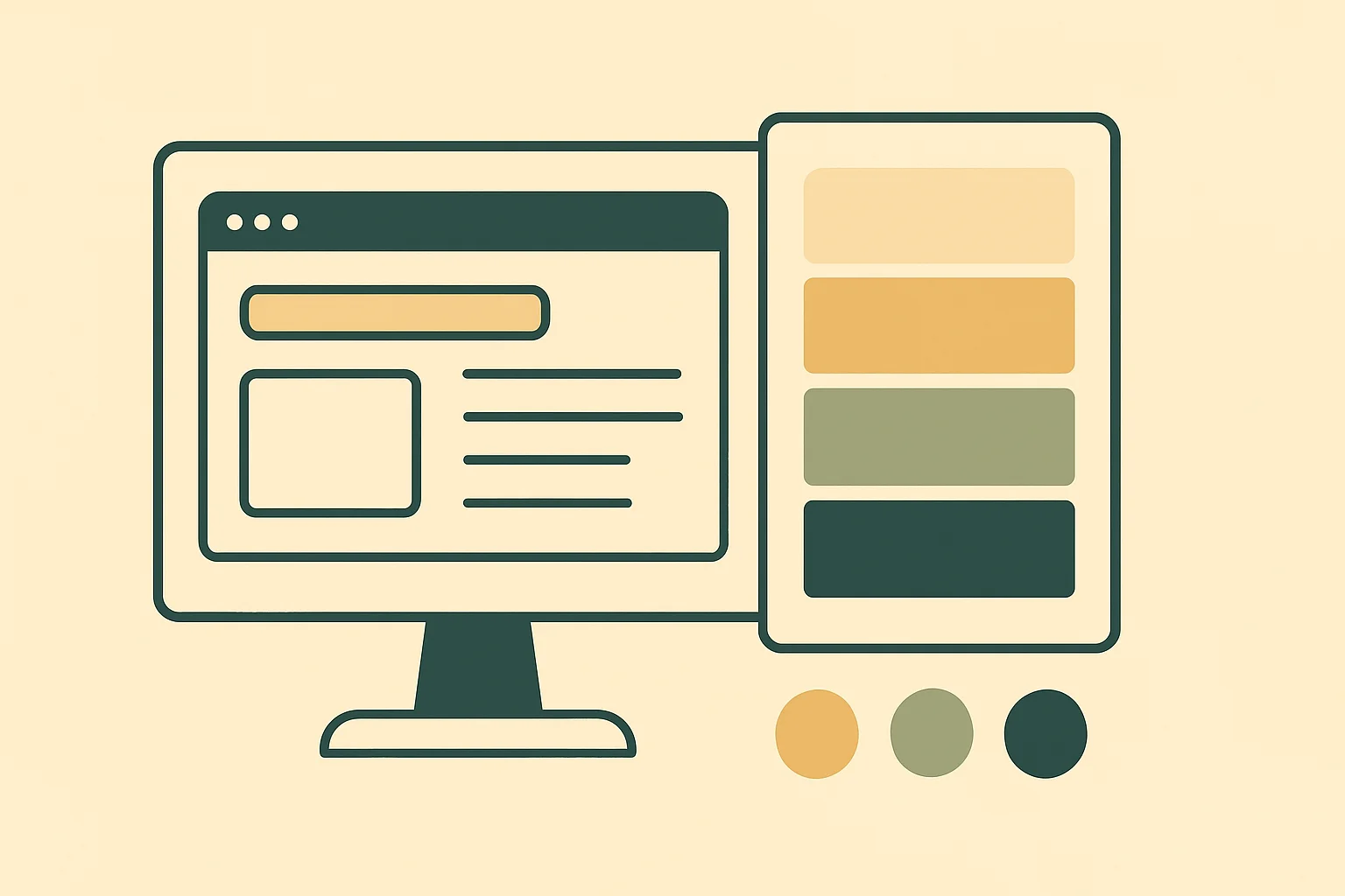
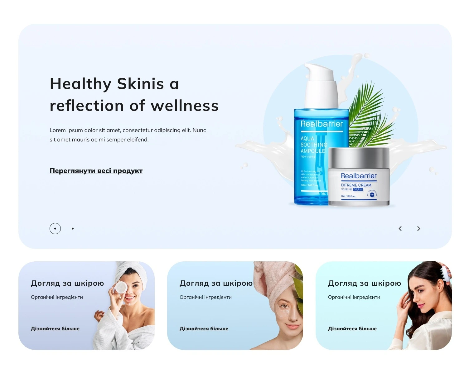
First screen: visual appeal and price
This is what the customer sees in the first 3 seconds. Our goal is to capture attention and provide key information for decision-making. 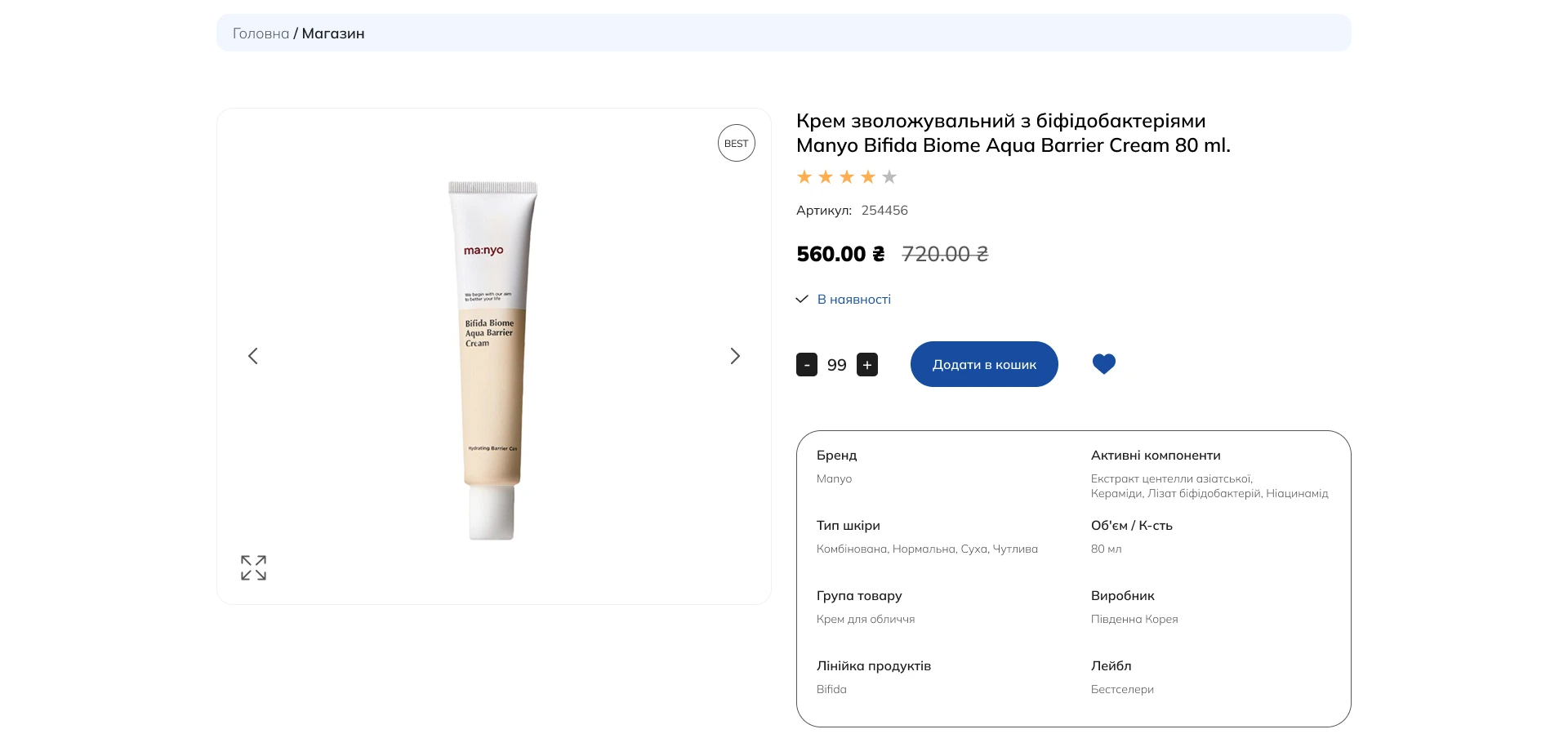
- High-quality photos and videos
Online, the customer buys with their eyes. Professional product photos from different angles, in detail, and in context are an absolute must-have. Adding a short video review can increase conversion by up to 80%, as it best demonstrates the product in use.
- Clear product name
The name should be clear, informative, and include key SEO keywords. The customer should immediately understand what the product is.
- Price and promotional offers
Price should be one of the most noticeable elements. If there is a discount, the old price should be crossed out — this is a strong psychological trigger. Clearly indicate the discount in percentage or currency.
- Convincing “Buy” button
This is the most important element on the page. The “Buy” button should be large, contrasting, and contain a clear call to action (CTA). It should not need to be searched for — it must immediately catch the eye.
Middle of the page: persuasive description and trust
When the customer is visually interested, they start looking for details and confirmation that you can be trusted. 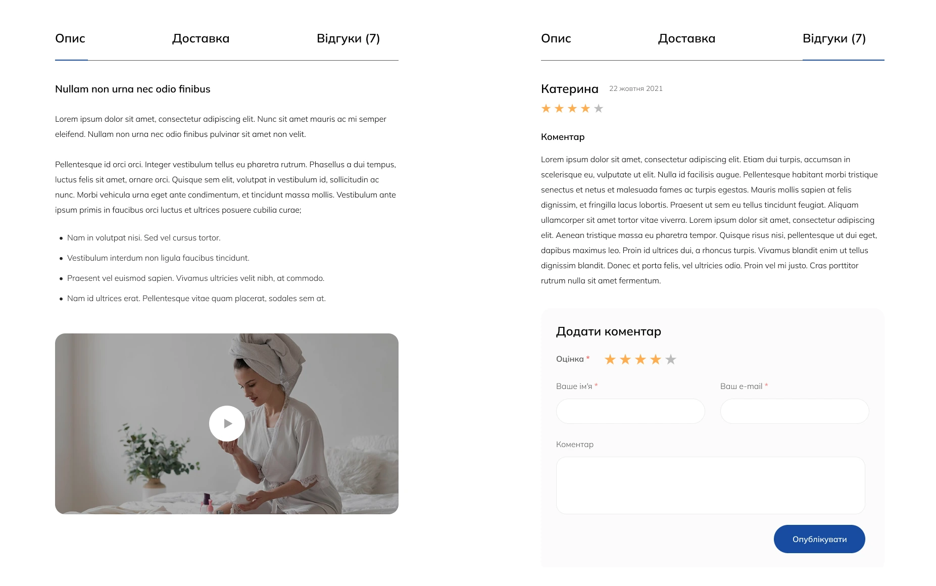
- Selling description
Forget boring lists of specifications. A good product description tells a story and speaks in benefits: not “2.5 GHz processor,” but “works smoothly even with complex programs.” Structure the text using headings and lists.
- Technical specifications
For customers who care about details, place all technical specifications in a separate, easy-to-read block or tab. This avoids overloading the main description.
- Reviews and social proof
Usually 9 out of 10 buyers read reviews before purchasing. Integrating a block with real customer reviews and ratings (stars) is the most powerful tool to increase trust and conversion on the product page.
Bottom of the page: cross-sells and service
When the customer is almost ready to buy, we can offer more and dispel their last doubts. 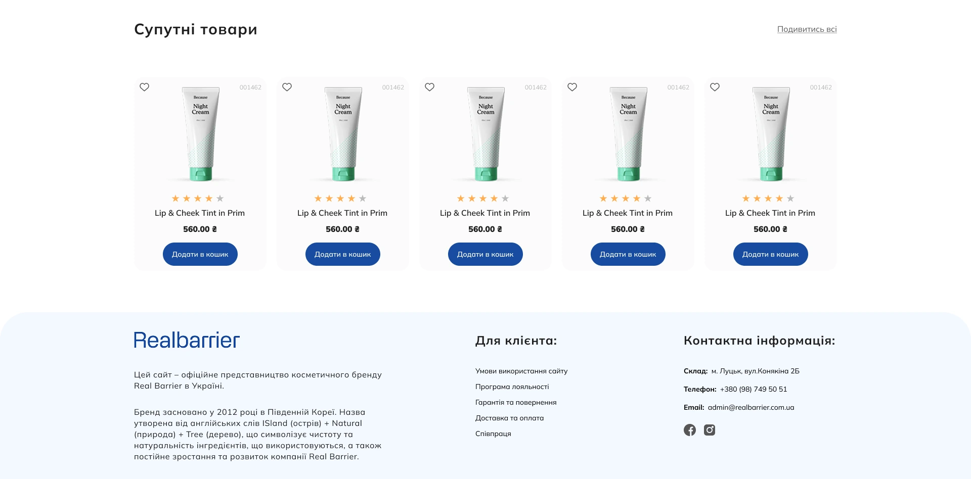
- “Customers also bought” block (Cross-sell / Up-sell)
This is a powerful tool to increase the average order value. Offer complementary products (cross-sell), e.g., a phone case, or a more expensive version of the product (up-sell). Properly configured recommendations can increase your revenue by 10–30%.
- Shipping and payment information
Don’t make the customer search for this information across the site. Place a short, clear block with the main conditions directly on the product card. This addresses one of the main objections before purchase.
- Guarantees and return policy
Clearly stated return and guarantee conditions provide security for the customer. It shows that you are confident in your product and can be trusted.
Checklist for reviewing your product card
Go through this short list and assess how well your current product pages meet high-conversion criteria.
- Photos/Videos — do you have at least 3–5 high-quality photos and a video review?
- Price/CTA — are the price and “Buy” button the most noticeable elements on the first screen?
- Description — does your description communicate benefits to the customer, not just dry specifications?
- Reviews — are real customer reviews integrated into the page?
- Cross-sells — do you offer complementary or alternative products (cross-sell/up-sell)?
- Service — is there clear information on shipping, payment, and return policy?
How we implement this at Kliox
Creating the perfect product card is not just about placing elements, but deep planning. When designing product pages in our projects, we pay attention to every detail.
We conduct a UX analysis to understand which information is key for your audience. Then we create a prototype where all 10 elements are arranged in the correct hierarchy for maximum impact.
Our approach ensures that each product card on your site is not just an informational page, but a powerful tool that works to increase product card conversion.
Conclusion: improving even one element can boost sales
Thus, the perfect product card is a system where each element serves its purpose: from high-quality product photos to clear return policies. You don’t have to implement all changes at once. Improving even one element, such as adding reviews or simplifying the description, can already positively impact your sales.
The key is to constantly analyze user behavior and test hypotheses. Remember that product page design is an ongoing optimization process that directly affects your business profitability.
Want your product cards to sell more?
Let’s analyze your current product pages together and identify growth opportunities.
Order a free UX audit. We will review one of your key product cards and provide 3 specific recommendations on how to increase its conversion.