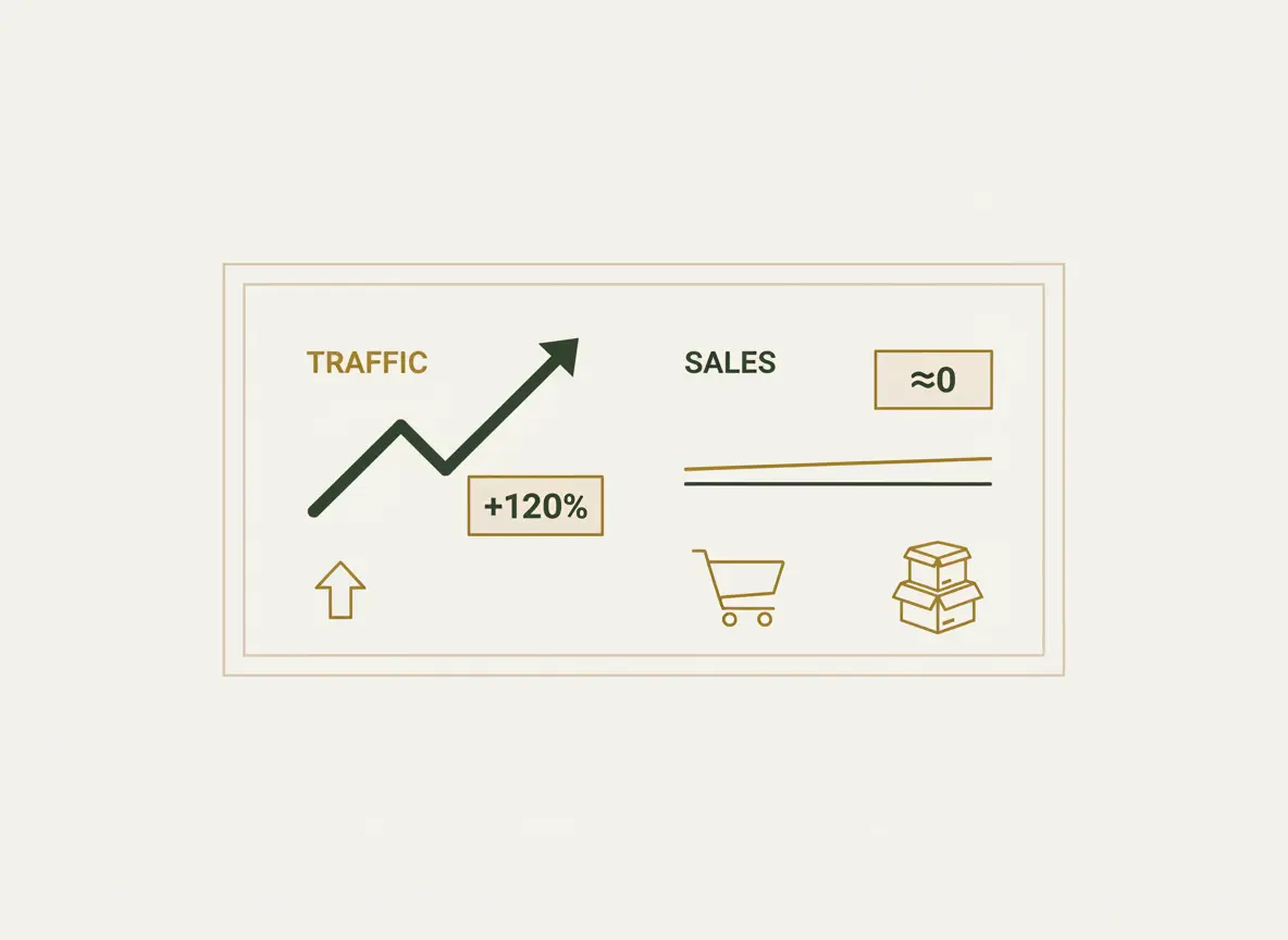
One of the most painful situations for an e-commerce owner: the Google Analytics counter shows hundreds of visitors, ad accounts are eating up the budget, and there is silence in the admin panel. No orders. This means that your online store is not selling despite having potential customers.
If there is traffic, the problem is not marketing. The problem is inside the website itself. It is like a ship that has gone off course: the engines (advertising) are running, but it never reaches the destination (sales).
Low conversion of an online store always has specific reasons. In this checklist-style article, we will analyze 7 of the most common “malfunctions” that knock your site off course and show you how to get it back on the path to profit.
Reason #1: Outdated design that kills trust
A design from the 2010s today subconsciously tells the visitor: “This store probably no longer works,” “Is it safe to enter my card details here?”, “If I pay, will they really ship the product?”. Bad design directly means a lack of trust, and without trust there are no sales in e-commerce.
Self-diagnosis checklist:
-
- Does your site look like the top-3 competitor sites in Google?
- Is there enough “air” (white space) on the site, or are text and images stuck together?
- Does it look equally professional on a large monitor and on a phone?
- The key question: would you yourself hesitate to enter your card details on such a site?
Solution: Conduct a redesign with a focus on cleanliness, minimalism, and visual elements that build trust. Modern design is not a matter of taste, but a fundamental requirement for sales.
Reason #2: Complicated navigation that turns the site into a maze
A customer does not come to you for a tour. They want to find the required product as quickly as possible. If the catalog is illogical, search does not work, and filters are missing, they will simply close the tab and go where it is easier. Every extra click is a potentially lost customer. 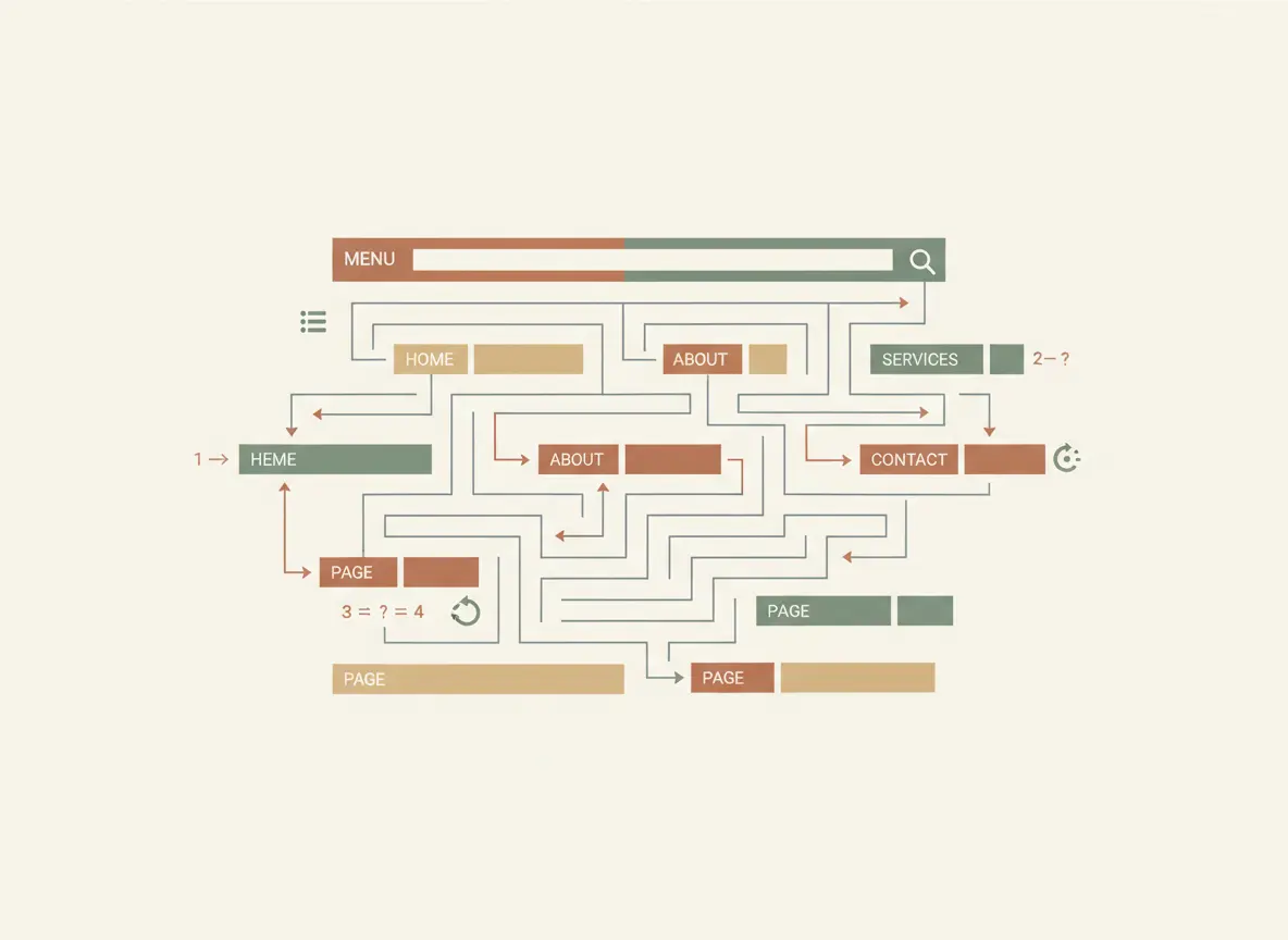
Self-diagnosis checklist:
- Can a visitor find any product within 3 clicks from the homepage?
- Do you have convenient and logical filters (by price, size, brand, characteristics)?
- Does on-site search work correctly even if the name is entered with a typo?
Solution: Redesign the catalog structure and navigation based on user logic, not your internal warehouse logic. Sometimes simply renaming menu items can increase conversion by several percent.
Reason #3: Slow page loading
Every second of waiting for your site to load is money you are literally burning. According to Google, if a slow website takes longer than 3 seconds to load, more than 50% of mobile users simply close the tab. You pay to bring a customer, and they leave without even seeing your product.
Self-diagnosis checklist:
- Open your site on a smartphone using mobile internet (not Wi-Fi). How many seconds do you wait? Be honest.
- Check your site using Google PageSpeed Insights. What is the score for mobile devices? If it is in the red zone (0–49), you have serious problems.
Solution: Perform technical optimization of website speed. Most often this includes image optimization, caching setup, and moving to higher-quality hosting.
Reason #4: Poor product photos and descriptions
In an online store, the customer cannot touch the product. Your photos and texts are their eyes and hands. If there are poor photos (dark, blurry, small) and short descriptions (“Blue dress, size M”) that do not give a full understanding of the product, the customer will not take the risk. They will not buy a pig in a poke.
Self-diagnosis checklist:
- Do you have at least 3–5 high-quality photos for each product from different angles?
- Do the photos show important details (fabric texture, fittings, seams)?
- Does your description answer potential customer questions (materials, care, exact dimensions in centimeters)?
Solution: Invest in a professional photo shoot or learn to take high-quality product photos yourself. Write detailed, human descriptions that sell not the product, but the solution to the customer’s problem.
Reason #5: Complicated checkout process
Checkout is the final straight. And this is exactly where many stores lose up to 70% of customers who have already added a product to the cart. A complicated checkout with lots of unnecessary fields, forced registration, and unexpected fees is a guaranteed way to kill a sale one step before payment. 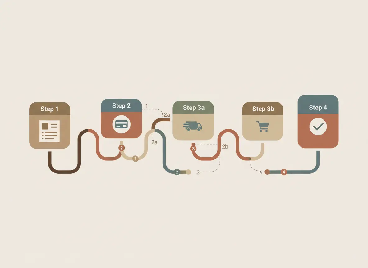
Self-diagnosis checklist:
- Do you force the customer to register to make a purchase?
- How many fields must be filled in to place an order? (Ideally 3–5).
- Do additional hidden fees appear at the final step?
Solution: Simplify the process as much as possible. Implement guest checkout, remove all unnecessary fields (middle name, postal code), and show the full cost including delivery as early as possible.
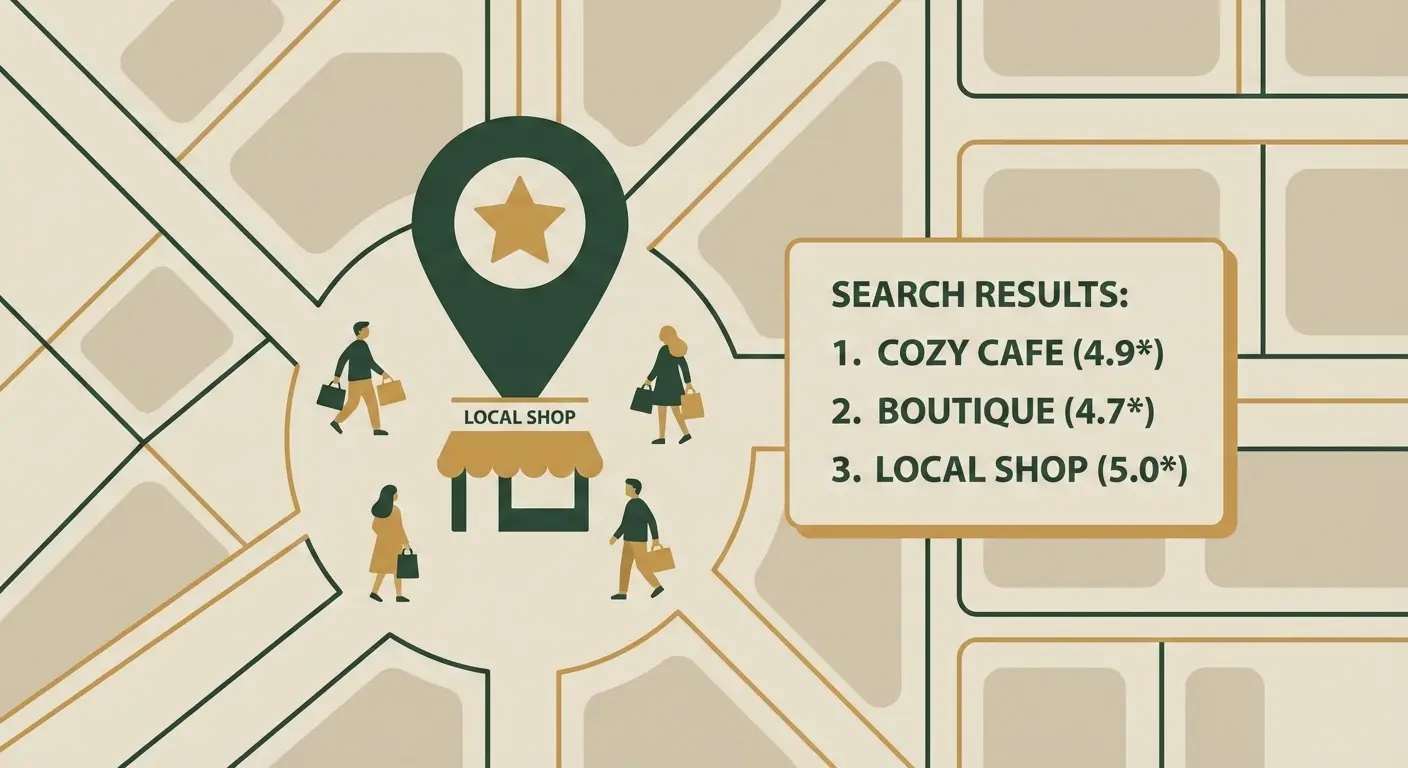
Reason #6: Lack of reviews and social proof
Buying from a new online store is always a small risk. People look for confirmation that you can be trusted in the experience of other buyers. If your site has a lack of reviews, this is a red flag. An empty Reviews section works worse than its complete absence.
Self-diagnosis checklist:
- Do your product pages have real customer reviews with ratings (stars)?
- Is there a separate section on the site with store reviews?
- Do you use other social proof (certificates, awards, customer photos with your product, logos of well-known partners)?
Solution: Work systematically on collecting reviews. Motivate customers to leave them (for example, offer a small discount on the next purchase). Publish not only perfect but also realistic reviews—this builds more trust.
Reason #7: Ignoring mobile users

More than 70% of traffic in Ukrainian e-commerce comes from mobile users. If your site is not adapted for smartphones (elements overlap, text is too small, buttons are impossible to tap with a finger), you are deliberately ignoring most of your potential customers.
Self-diagnosis checklist:
- Open your site on a phone. Is it convenient?
- Try to go through the entire path—from product search to checkout—using only a smartphone. At which stage did you get stuck?
Solution: Create a high-quality responsive design that makes purchasing from a smartphone just as simple and convenient as from a computer. Today this is not an option, but a necessity.
How we can help: from diagnosis to treatment
It can be difficult to find all the leaks in your e-commerce ship on your own. An external view from an experienced specialist often reveals problems that you have simply stopped noticing.
That is exactly why we at Kliox have developed a comprehensive online store audit service. We do not just check the site against this checklist. We conduct an in-depth analysis of more than 50 parameters: from technical aspects (speed, code) to usability and marketing logic.
As a result, you receive not general advice, but a detailed step-by-step action plan to increase conversion.
Conclusions: stop guessing, start analyzing
If your online store is not selling, the reason almost always lies in one or more of the problems listed above. The key is to stop acting blindly (“let’s change the button color”) and start systematically analyzing and fixing weak points. Only this approach will allow you to turn your site from a cost center into a powerful profit-generation tool.
Ready to find the real reason for low sales?
Order a free express audit of your online store. Our specialist will perform a quick diagnosis of your site based on key points, identify the most obvious problems that are killing your conversion, and provide recommendations on how to fix them.