

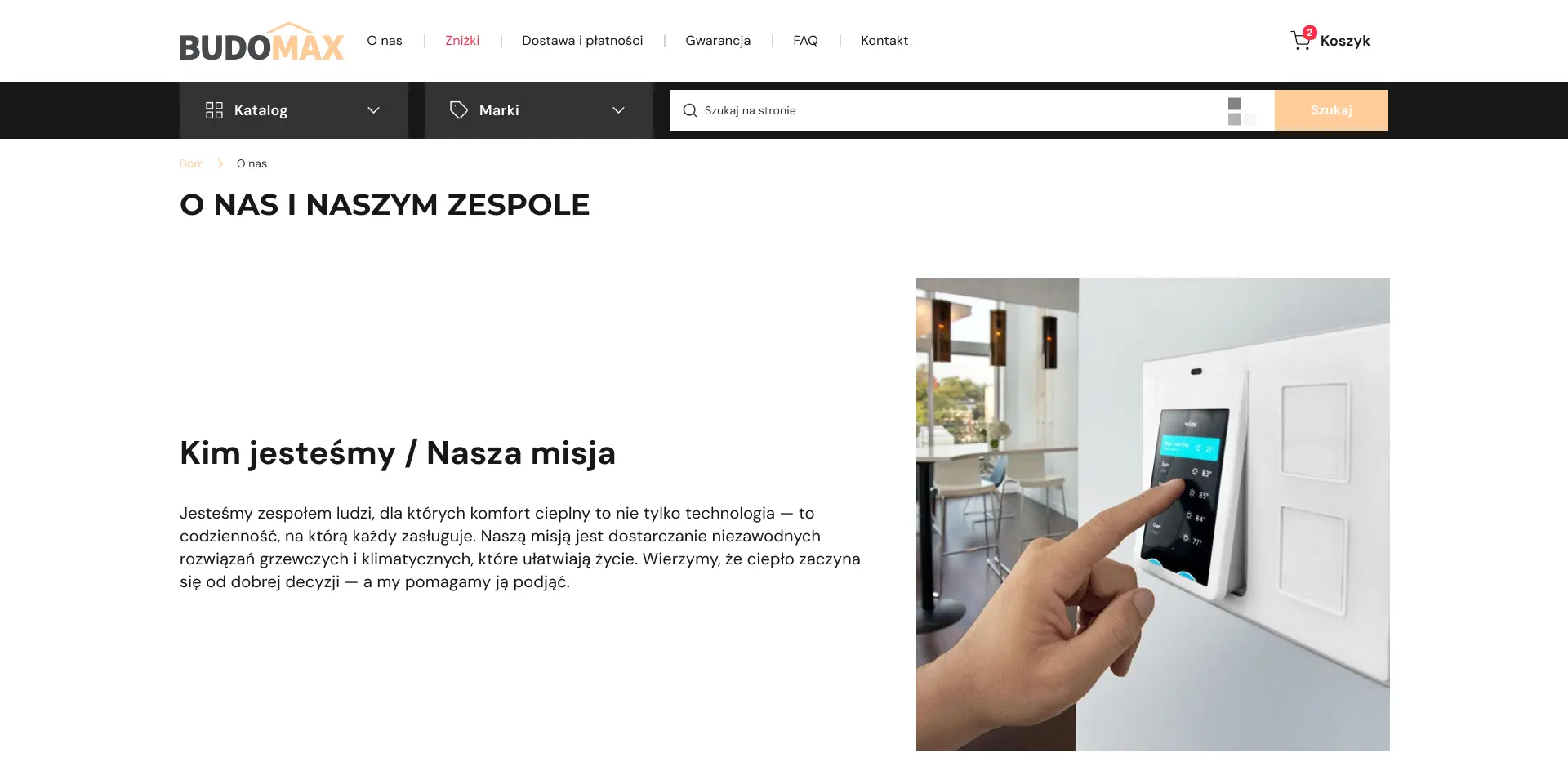
We created a logical catalog structure with multi-level filters by equipment type, power, brand, and purpose.
Visually, technical reliability and a professional approach were emphasized through a restrained color scheme and clear typography.
We implemented flexible management of products, characteristics, filters, and integration with CRM to automate applications.
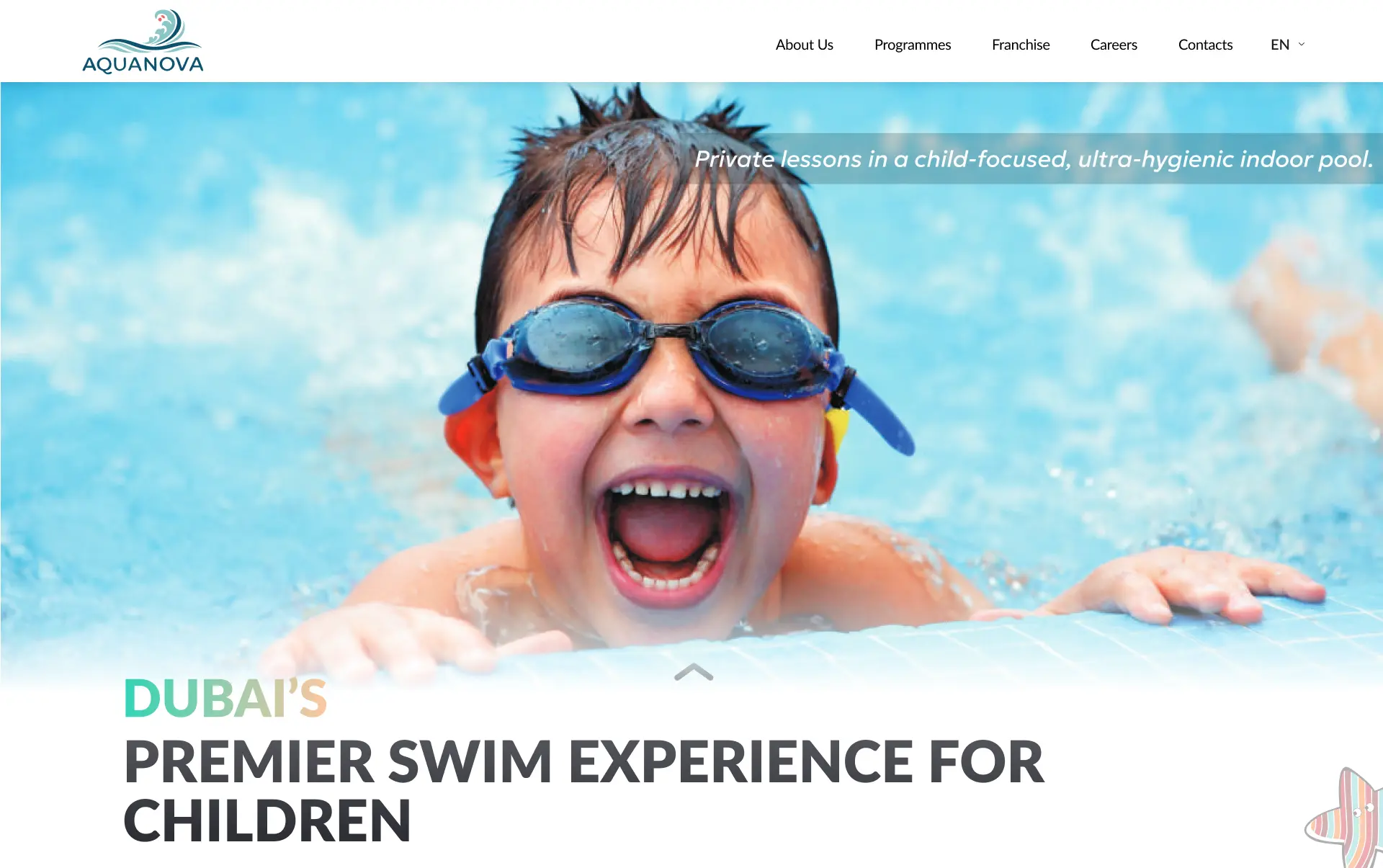
We built a structure that logically leads from benefits to registration. We emphasized privacy, water safety, and the coach's individual approach.
Clients gained access to class history, subscription management, and online payments.
We automated the schedule, pool loading control, and communication with parents.
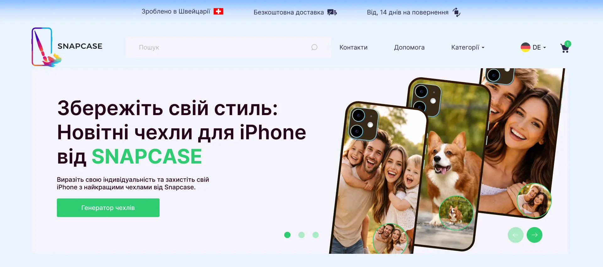
We created a dark interface with a focus on the product's visuals and ease of use.
Users can upload a photo, add text, choose a color, and immediately see a preview of their future case.
We've optimized image loading and element interactions to ensure smooth operation even on low-end devices.
We analyze how your customers behave on mobile devices. We identify critical scenarios (search, filter, checkout) that should work perfectly.
We design layouts where the main focus is on ease of interaction (button size, distance between elements, "burger menu" logic).
We write clean code in Next.js (or other technology), focusing on reducing page weight and optimizing images for fast loading.
We integrate features that are only convenient on mobile: autofill fields, quick payment methods (Apple Pay/Google Pay), correct keyboard display.
We test not only in browser emulators, but also on real devices with different internet speeds to ensure that the responsive site works flawlessly for everyone.
We check and optimize Core Web Vitals. We ensure that Google correctly indexes your mobile version of your store as the main one.
// How much does professional development of responsive mobile design cost?

- Professional website appearance — fast launch on a responsive template.
- Ready catalog — up to 10 products added for a quick sales start.
- Key store functionality — your customers can easily choose and purchase.

- Your brand uniqueness — we create a custom design that inspires trust.
- Large assortment — full catalog with 100+ products prepared.
- Convenient search for customers — filters, categories, and variations configured.
- Business-oriented architecture — unique site logic and structure developed from scratch.
- Any unique functionality — B2B accounts, bonus systems, complex accounting implemented.
- Full business automation — deep integration with 1C, ERP, and warehouses.
Mobile version of the store: how responsive design has become the main tool for sales and SEO
More than 70% of Ukrainian customers today interact with your online store exclusively from a smartphone. This is not just a trend — it is the dominant way of doing business.
Ignoring this fact means deliberately giving away traffic and profit to competitors. If your mobile version of the store is not optimized, you lose conversion every day, and Google, which indexes sites based on the Mobile-First principle, lowers your SEO ranking.
At Kliox, we approach the development of a responsive website as an engineering project, where every pixel works for your profit.
The cost of inaction: how poor mobile UX drains your advertising budget
Many entrepreneurs see mobile traffic and assume everything is fine. But if a customer cannot conveniently tap a button, fill out a form, or wait for an image to load — they simply leave.
How does this happen?
Loss of conversion on the first click
Studies show that 53% of mobile users leave a site if it takes longer than 3 seconds to load. Even if you have invested thousands of hryvnias in Google Ads or Meta Ads, poor loading speed on mobile nullifies these efforts. This is a direct loss of marketing investment.
Checkout failure
The checkout process on mobile is the most vulnerable point. Inconvenient forms, small fonts, lack of autofill, or Google Pay / Apple Pay — these guarantee abandoned carts.
Negative impact on LTV
The first negative experience with a mobile site makes a customer lost forever. They will not return, even if your product is perfect.
The foundation of success: 3 pillars of professional mobile adaptation
We design a responsive website not as an option, but as a full-fledged system based on three principles.
- Mobile-First UX and navigation that works with a finger.
We start design with smartphone layouts. Every element (buttons, links, menus) is optimized for finger interaction, not a cursor. Navigation is built so that key categories are available in 1–2 clicks. This is not just a burger menu, but a logical system that leads the customer to the goal.
- Lightning-fast speed and technical optimization.
Clear image management — we automatically compress and convert all images into modern formats (WebP), which are 5–10 times smaller without quality loss.
Optimized code — we write clean, lightweight code that loads only what the user needs at a given moment. This allows achieving Core Web Vitals metrics out of the box and handling peak loads.
- Testing on real scenarios and devices.
We do not limit ourselves to emulators. Our QA engineers test the mobile version of the store on dozens of real smartphones and tablets, with different types of internet connections (3G, 4G, Wi-Fi), simulating real usage conditions. This ensures that your site works flawlessly for every customer.
Mobile-First SEO: how Google evaluates your site on mobile
Since 2021, Google has officially switched to Mobile-First indexing. This means that your SEO rating is primarily determined by how well your site looks and performs on mobile devices.
Core Web Vitals — we optimize three key metrics: LCP (main content loading speed), FID (interactivity), and CLS (content stability). High scores on these metrics lead to higher search rankings.
Navigation usability — Google evaluates how easily a user can navigate your site on mobile. Our solutions ensure a clear hierarchy and breadcrumbs for navigation.
Responsive design as a standard — we implement responsive design that allows the site to automatically adapt to any screen size. This signals to Google that your site is modern and meets requirements.
Content strategy for mobile users: scanning instead of reading
Mobile users read differently. They do not scroll through long texts. They scan information, looking for keywords and visual anchors.
Your SEO content may be perfect for desktop, but on mobile it turns into a wall of text that no one reads.
We help adapt your content strategy to mobile realities. This means:
- Short paragraphs and frequent use of bullet/numbered lists.
- Highlighting keywords in bold.
- Infographics and short videos that are easy to consume on the go.
Thus, your expert content remains effective on mobile, attracting traffic and increasing loyalty, which directly affects LTV (lifetime customer value).
Personalization and fast payment methods on mobile
A mobile device is the most personal gadget, which opens up huge opportunities for personalization and faster purchases.
But the problem is that your site does not use the phone’s capabilities to simplify checkout.
We offer integration with mobile payment systems (Google Pay / Apple Pay). In addition, we can implement personalized push notifications (if there is a mobile app) or dynamic recommendation blocks on the site based on geolocation.
Under these conditions, you not only speed up checkout to 1–2 clicks, but also increase loyalty by offering the most relevant and convenient experience, which increases the average order value (AOV).
Kliox: your partner in digital adaptation
Our expertise in mobile adaptation is the result of hundreds of projects. We do not just make a responsive layout. We create a comprehensive solution that includes:
- A deep audit of your current mobile version.
- Design of a Mobile-First UX strategy.
- Development of a fast frontend using Next.js.
- Comprehensive SEO optimization for Mobile-First indexing.
- Analytics setup to track mobile conversion.
Overall, mobile adaptation is not just a feature, but the foundation of successful e-commerce. It directly affects your sales, SEO ranking, and customer loyalty. Investing in high-quality responsive design today means investing in the survival and growth of your business tomorrow.
Is your mobile version of the store not meeting expectations? Order a free audit. We will conduct a detailed analysis of your site on mobile devices, identify weak points where you are losing conversion, and provide a clear plan to improve them.