Color is the language your brand speaks to the customer even before they read the first word. Studies show that up to 90% of first impressions of a product are based on color.
A poorly chosen palette can subconsciously repel a buyer, while the right one can build trust, highlight product advantages, and push toward a purchase.
Choosing colors for a website is not a matter of taste, but a pragmatic marketing decision. In this article, we will cover the basics of color psychology in e-commerce, explain what emotions key marketing colors evoke, and provide a simple framework for creating a harmonious online store design.
What each color communicates: basic associations
Each color carries a powerful emotional charge shaped over years in our culture. Your task is to use these color associations to build the right image for your brand. 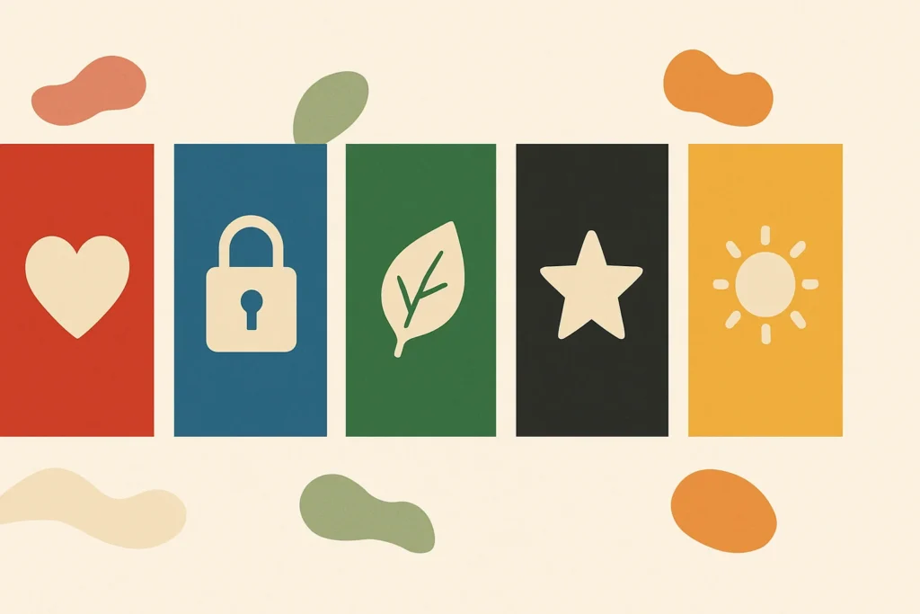
Red: Energy, attention, sales
Red is the strongest emotional trigger. It shouts: Look here!.
Associations — energy, passion, action, urgency, danger.
Where to use in e-commerce — it is an ideal CTA button color (“Buy”, “Add to cart”), for discount price tags and promotional banners. It stimulates quick decision-making.
Example niches: fast food, entertainment services, adult product stores.
Important! Don’t overdo it. Too much red can cause anxiety and aggression.
Blue: Trust, reliability, security
Blue is the color of calm and stability. It is the corporate standard for businesses that want to appear serious and reliable.
Associations — trust, security, professionalism, intelligence, calm.
Where to use in e-commerce — ideal for the site header, footer, benefit icons (Free shipping, Quality guarantee), and checkout pages. It reassures customers and convinces them their data is safe.
Example niches: technology, finance, healthcare, home appliances, B2B sector.
Green: Nature, health, harmony
Green is strongly associated with nature, eco-friendliness, and health. It is also the color of permission and confirmation.
Associations — nature, health, freshness, growth, money.
Where to use in e-commerce — for success messages (Product added to cart) and order confirmation buttons. It is the primary color for online store design in eco-products, cosmetics, pharmacies, and gardening goods.
Example niches: organic products, pharmacies, vegan goods, outdoor and travel gear.
Black: Luxury, premium, elegance
Black embodies luxury and exclusivity. It creates a sense of power and sophistication.
Associations — luxury, elegance, power, premium quality.
Where to use in e-commerce — works best as the main background for websites selling expensive products.
Important! Black requires flawless photography, high-quality typography, and plenty of whitespace; otherwise, the site will look gloomy.
Example niches: luxury clothing brands, high-end watches, jewelry, premium cars.
Yellow and Orange: Optimism and action
These colors are warm, friendly, and full of enthusiasm. They attract attention well, but more gently than red.
Associations — optimism, happiness, friendliness, creativity (yellow); energy, confidence, action (orange).
Where to use in e-commerce — ideal for CTA buttons, offer banners, and subscription forms. Orange is often used by major e-commerce players (like Amazon) for key buttons because it balances attention-grabbing with a positive emotion.
Example niches: children’s products, creative services, travel agencies, youth-oriented brands.
How to choose the perfect palette for your store?
Knowing color meanings is only half the job. The key is to combine them into a harmonious system that matches your brand identity and resonates with your target audience.
Step 1: Start from your niche and your customer
Before opening a color palette, answer two questions:
- What do you sell? If it’s organic cosmetics, natural shades (green, beige) make sense. If it’s premium watches, black and gold are appropriate. Color should reinforce associations with your product.
- Who is your customer? Choosing colors for a website also depends on demographics. Bright, bold colors are better received by younger audiences, while older users prefer calmer, more classic palettes.
Step 2: Use the 60-30-10 rule
This is a classic interior design principle that works perfectly on the web as well. It helps create a balanced, visually pleasing palette without turning the site into a rainbow.
60% — Primary color
This is a neutral, usually light background (white, light gray, beige). Its task is not to distract from the main focus—your product.
30% — Secondary color
This is your main brand color. It is used for key blocks: header, footer, headings, icons. It sets the overall mood and brand recognition.
10% — Accent color
This is the brightest color in the palette and should contrast with the previous two. It is used sparingly for the most important interactive elements: CTA button color, links, cart icons, promotional price tags.
This approach creates visual hierarchy and intuitively guides the user’s eye where you need it, directly affecting conversion.
Our approach to design at Kliox
At Kliox, we believe that online store design starts not with visuals, but with strategy. We don’t ask clients: What is your favorite color?. We ask: What emotions should your brand evoke? What story do you want to tell?. 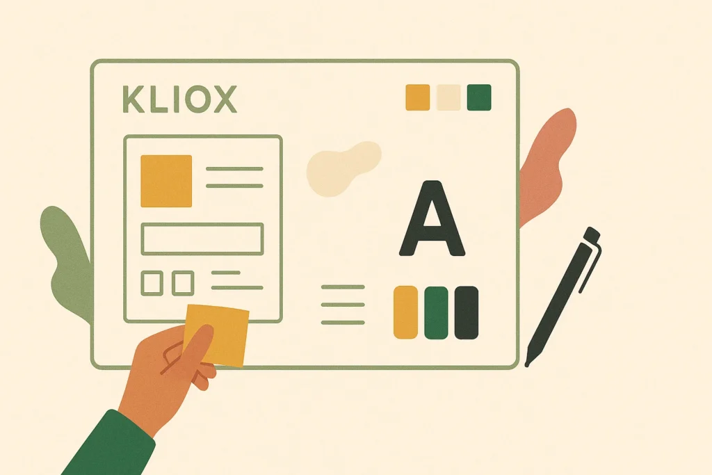
Our process begins with creating a mood board — a visual board where, together with the client, we collect references, textures, fonts, and colors that align with the goals and values of their branding.
Only after the concept and emotional direction are approved do we move on to developing the color palette using the 60-30-10 rule and creating a unique visual style.
Conclusions. Color is your silent salesperson
A well-chosen palette is a powerful tool that works for you 24/7. It builds trust, evokes the right emotions, guides attention, and as a result increases sales. Color psychology is not magic, but a science that must be used to achieve business goals.
Want your brand to evoke the right emotions?
Let’s develop a unique visual style for your online store together. Order a free consultation, and we’ll discuss how to use color and design to tell your brand’s story and make customers fall in love with it.