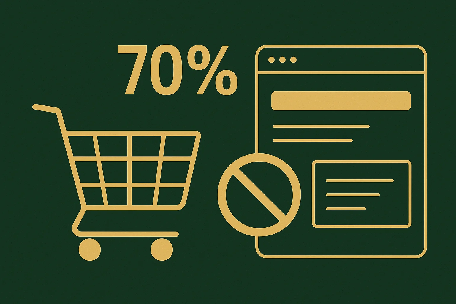
According to Baymard Institute, the average global rate of cart abandonment is 69.99%. Think about it: 7 out of 10 customers who have ALREADY chosen a product and added it to the cart leave your site with nothing. This is not just statistics — this is your lost money that you were almost holding in your hands.
The main culprit is a complex and unclear checkout process. Every extra step, every confusing field is a hole through which your profit leaks.
In this article, we will break down 5 rock-solid principles of checkout optimization that will help you increase cart conversion and recover a significant portion of these losses.
Principle #1: Ask only for what is critically necessary
Every extra input field is a micro-barrier that forces the customer to think, hesitate, and waste time. And online, time is money. Your money. 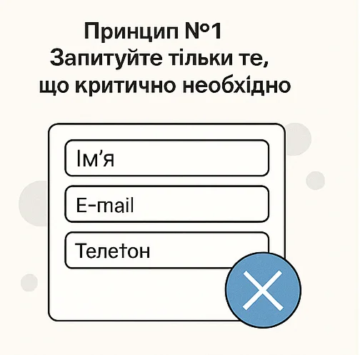
Which fields should be removed mercilessly?
Audit your form. Which of these do you really need to ship an order?
Middle name? It is not required for shipping via Nova Poshta. Remove it.
Postal code? Most delivery services have long worked without it, identifying branches by address or name. Remove it.
Re-entering email or password? This is a relic of the past that only annoys users and causes errors. Leave a single field.
Your goal is the absolute minimum: Full name, phone number, city, and branch/parcel locker number. That’s it. Any additional information (for example, for marketing) can be collected after a successful purchase.
The fewer fields — the higher the conversion. This is not theory; it is an e-commerce axiom.
Principle #2: Allow checkout without registration (Guest checkout)
Forced registration is the main conversion killer at the checkout stage. Imagine this situation: you spent money on ads, attracted a customer, they chose a product, are ready to pay… and right at the checkout you place a guard who demands filling out a form and getting a club card. Absurd? That’s exactly what forced registration looks like. 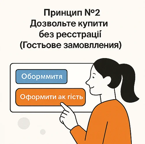
Many store owners make this mistake thinking, “I need a customer base for newsletters.” This is a strategic miscalculation. You are trying to get a customer for future sales, but you are losing their money right now. Solve the customer’s problem (buy quickly), not yours (collect a database).
How to properly implement guest checkout?
Make the “Checkout as a guest” option the primary one. It should be the first and most prominent button. Do not hide it under “Register”.
Offer to create an account On the “Thank you for your order!” page, you can say: “Want to track your order and not re-enter details next time? Create an account in one click.”
At this stage, the customer is already satisfied, trusts you, and is much more likely to agree. You get both the sale and a loyal customer without creating any barriers on the way to payment. Guest checkout is a must-have feature.
Principle #3: Show the full cost upfront
Nothing kills the desire to buy like unexpected extra charges at the final step. The customer sees a total of 1000 UAH in the cart, clicks “Checkout,” and suddenly the amount turns into 1120 UAH due to a payment fee and an unclear packaging charge. This feels like deception and is one of the main reasons for cart abandonment. 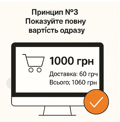
Your task is to ensure 100% price transparency already at the cart stage. The customer must clearly see the final amount they will pay.
How to ensure price transparency?
- Integrate a shipping cost calculator. Modern modules allow automatic calculation of Nova Poshta or Ukrposhta shipping costs as soon as the customer selects a city.
- Clearly state who pays the payment processing fee. If you do not cover cash-on-delivery fees, state this honestly next to the payment option: Cash on delivery (additional carrier fee 2% + 20 UAH).
- Eliminate hidden fees. Any order processing or packaging fees are toxic practices that destroy trust and drive customers to competitors.
The full cost shown in advance does not scare customers away — it builds trust. People understand what they are paying for, which only strengthens their decision to buy from you.
Principle #4: Give customers familiar payment and delivery options
You may perfectly design the early steps, but if at the payment stage the customer does not find a convenient option, they will simply leave. Limiting choice is a direct path to lost sales. 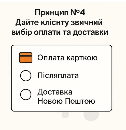
Do not try to force the payment method that is more profitable for you (for example, card-only full prepayment). Your goal is to make the process as comfortable as possible for the buyer.
What is the minimum required set of options?
- Online card payment (LiqPay/WayForPay/Stripe). The fastest and safest option for most buyers. This should be the default.
- Cash on delivery. For many Ukrainians, this is still a key trust factor, especially for a first purchase from a new store. The absence of this option can cut off up to 30–40% of potential customers.
- Nova Poshta delivery (branch/parcel locker). The de facto market standard.
- Ukrposhta delivery. Important for small towns and for those who want to save on shipping.
Everything else (Apple Pay/Google Pay, courier delivery, pickup) are excellent additions, but these four items are the mandatory baseline for 99% of online stores in Ukraine.
Principle #5: Show progress and reassure
The checkout process is a small stress for the buyer. Did I enter everything correctly? How many steps are left? Your task is to guide the customer by the hand, visually showing where they are and how much remains.
This works like a car navigator: when you see that only 2 minutes remain, you are calm. If you do not know how much longer it will take, any turn can become the last straw.
How to implement this?
The simplest and most effective way is a visual progress bar at the top of the checkout page.
[ Contact information ] -> [ Delivery ] -> [ Payment ]
Even such a simple indicator gives the customer a sense of control. They understand that the process is finite, logical, and they are almost at the goal. This significantly reduces anxiety and the percentage of cart abandonment at the final stages.
Ideally, this should be a one-page checkout where all forms are placed on a single page divided into these logical blocks. This allows the customer to see the entire process and not fear unexpected steps.
How we design checkout at Kliox
For us, checkout is not a matter of design or personal preference. It is a matter of data and conversion. We base our work on the 5 principles described above, but we do not take them on faith — we test them for each specific project.
Our key tool is A/B testing. For one store, a one-page checkout may work perfectly, while for another, with complex logistics and options, a sequential multi-step process will show better conversion.
We analyze user behavior, formulate hypotheses (for example, will removing the middle name field increase conversion?), test them on real traffic, and implement only those changes that are proven to increase your revenue.
Our goal is to create a checkout that does not just work, but becomes your best salesperson, guiding the maximum number of visitors to payment.
Conclusions: simple checkout = more sales
Your checkout process is either your best salesperson or the biggest hole in your budget. Implementing even a few of these checkout optimization principles can significantly reduce the number of abandoned carts and turn interested visitors into real buyers. This is not magic, but a systematic approach to increasing sales.
Want to know exactly where you are losing money?
Order a free audit of your checkout process. Our specialist will analyze your checkout step by step, identify weak points that kill conversion, and provide a clear list of recommendations to increase your sales.